library(sciSpatialR)
library(terra)
#> terra 1.9.50
Three questions about a layer
A raster that has been pre-processed and aligned with the reference grid still has to be looked at before it is trusted. Three questions cover most of what goes wrong, and one function answers each:
-
What is actually in it?
raster_stats(): cell counts, missing values, and value summaries as a table. -
How are the values distributed?
plot_hist(): where they pile up, and how long the tails are. -
Does the map look right?
plot_raster(): the spatial pattern, and whether the layer is clipped where it should be.
All three accept a SpatRaster or a path, so they work on
a layer in memory and on a freshly exported GeoTIFF.
A layer to inspect
Everything below runs on a synthetic surface on the reference grid, built so this vignette needs no external data. It is deliberately imperfect: a handful of absurd outliers, and a rectangular hole where an upstream process dropped cells.
set.seed(42)

ref   <- ab_grid()
east  <- init(ref, "x")
north <- init(ref, "y")

# A smooth surface with some structure to look at
chm <- 14 +
  6 * sin(east / 70000) * cos(north / 110000) -
  4 * (north - 5.4e6) / 1.2e6
chm <- chm + init(ref, function(n) rnorm(n, 0, 0.6))

# Sensor glitches: a few cells with impossible values
glitch <- sample(which(!is.na(values(ref, mat = FALSE))), 40)
chm[glitch] <- 250

# A gap left by an upstream process
chm[300:360, 180:240] <- NA

chm <- mask(chm, ref)
names(chm) <- "canopy_height"
chm
#> class       : SpatRaster
#> size        : 1234, 695, 1  (nrow, ncol, nlyr)
#> resolution  : 1000, 1000  (x, y)
#> extent      : 170616.2, 865616.2, 5425532, 6659532  (xmin, xmax, ymin, ymax)
#> coord. ref. : NAD83 / Alberta 10-TM (Forest) (EPSG:3400)
#> source(s)   : memory
#> varname     : grid_1km
#> name        : canopy_height
#> min value   :      2.185233
#> max value   :           250
raster_stats()
raster_stats(chm)
#> Cells within Alberta only.
#>
#> Columns:
#>   layer     Layer name; the file name when the band is unnamed
#>   source    File read from; NA for a raster held in memory
#>   n_total   Cells the aoi covers
#>   n_na      Aoi cells the layer leaves empty (NA)
#>   pct_na    Percentage of aoi cells with no value
#>   n_valid   Cells carrying a value
#>   min       Smallest valid value
#>   max       Largest valid value
#>   mean      Mean of the valid values
#>   sd        Standard deviation of the valid values
#>           layer source n_total n_na    pct_na n_valid      min max     mean
#> 1 canopy_height   <NA>  664749 3721 0.5597602  661028 2.185233 250 11.82385
#>         sd
#> 1 3.847776
Every column is defined above the table. That printing is the
verbose argument, on by default; turn it off when the table
is going somewhere other than a human:
stats <- raster_stats(chm, verbose = FALSE)
stats$pct_na
#> [1] 0.5597602
The first line of that printout is the other thing to read: the
statistics cover the cells inside aoi, which defaults to
the Alberta boundary the reference grid covers. n_total is
the number of cells the boundary covers rather than the number of cells
in the layer, so pct_na says how much of the province the
layer leaves empty — the gap above, not the corners of the rectangle the
export arrived on. Values outside the boundary are left out of the
summaries entirely, which matters for a layer that carries data across
the border.
Pass any other polygon to summarise a smaller area, or
aoi = NULL for every cell of the layer:
raster_stats(chm, aoi = NULL, verbose = FALSE)
#>           layer source n_total   n_na   pct_na n_valid      min max     mean
#> 1 canopy_height   <NA>  857630 196589 22.92236  661041 2.185233 250 11.82389
#>         sd
#> 1 3.847784
Quantiles are optional:
raster_stats(chm, quantiles = c(0.02, 0.5, 0.98), verbose = FALSE)
#>           layer source n_total n_na    pct_na n_valid      min max     mean
#> 1 canopy_height   <NA>  664749 3721 0.5597602  661028 2.185233 250 11.82385
#>         sd       q2      q50      q98
#> 1 3.847776 5.214466 11.77817 18.36713
A folder of exports
x can also be a path, or a directory, which is the point
of the source column: a QA pass over everything that came
back from a batch export is one call.
export_dir <- file.path(tempdir(), "exports")
dir.create(export_dir, showWarnings = FALSE)

writeRaster(
  aggregate(chm, 8, na.rm = TRUE),
  file.path(export_dir, "canopy_height_8km.tif"),
  overwrite = TRUE
)
writeRaster(
  aggregate(chm, 16, fun = "max", na.rm = TRUE),
  file.path(export_dir, "canopy_max_16km.tif"),
  overwrite = TRUE
)

raster_stats(export_dir, verbose = FALSE)
#>           layer                source n_total n_na    pct_na n_valid      min
#> 1 canopy_height canopy_height_8km.tif   10605   49 0.4620462   10556 4.031532
#> 2 canopy_height   canopy_max_16km.tif    2713    9 0.3317361    2704 5.672810
#>         max     mean        sd
#> 1  23.13978 11.84470  3.327287
#> 2 250.00000 17.12291 28.730712
Both rows carry the same layer name, because both files inherited the
band name from the raster they were written from; source is
what tells them apart. It is NA for a raster held in
memory. A band written without a name would come back as
terra’s lyr.1.
An empty layer returns NA for the value summaries rather
than the NaN and Inf that min()
and mean() produce on nothing:
raster_stats(mask(chm, chm > 1e6, maskvalues = FALSE), verbose = FALSE)
#>           layer source n_total   n_na pct_na n_valid min max mean sd
#> 1 canopy_height   <NA>  664749 664749    100       0  NA  NA   NA NA
Statistics describe cell values. On a categorical layer they summarise the class codes, which is rarely useful.
plot_raster()
plot_raster(chm)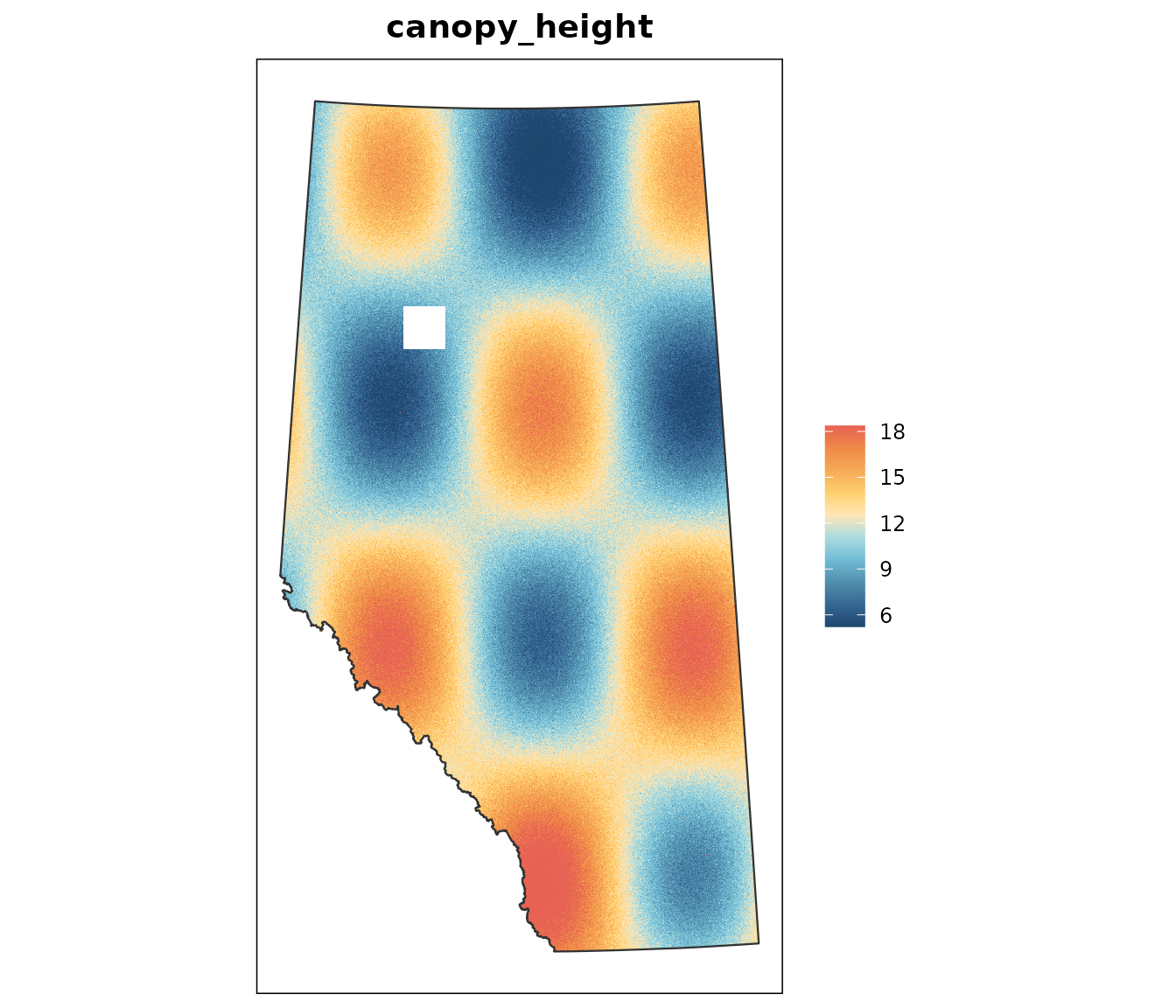
Three defaults are doing work there.
The colour scale is clamped to central quantiles. A bunch of cells at an extreme would otherwise compress everything real into the last few percent of the ramp. Compare the unstretched version, which is what a naive plot of this layer gives you:
plot_raster(chm, stretch = NULL, main = "No stretch")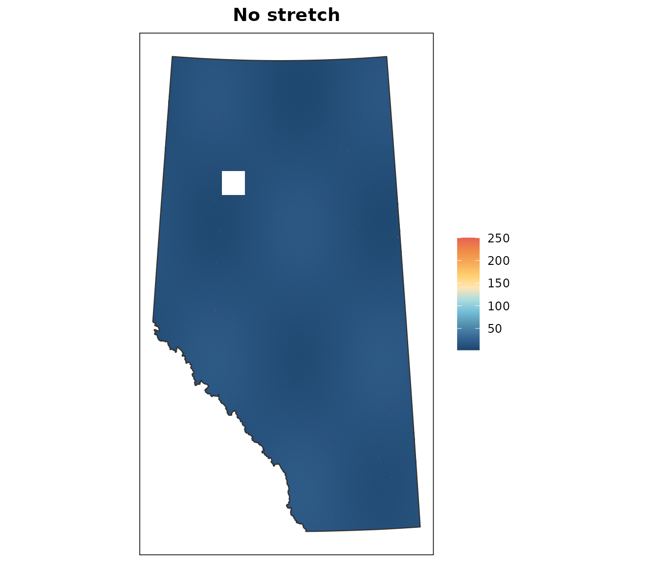
The pattern is gone. stretch takes any two
probabilities, and values beyond them are drawn in the end colours
rather than dropped:
plot_raster(chm, stretch = c(0.25, 0.75), main = "Aggressive stretch")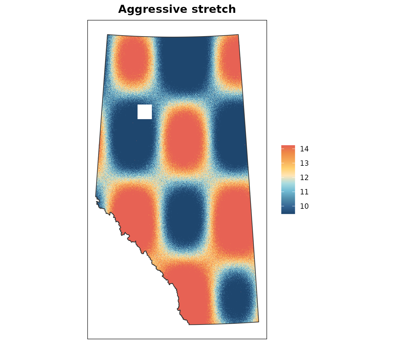
The Alberta boundary is drawn on top, which is how
you see that a layer is clipped to the province. Pass any polygon to
check a different footprint, or NULL for none:
plot_raster(chm, boundary = NULL, main = "No overlay")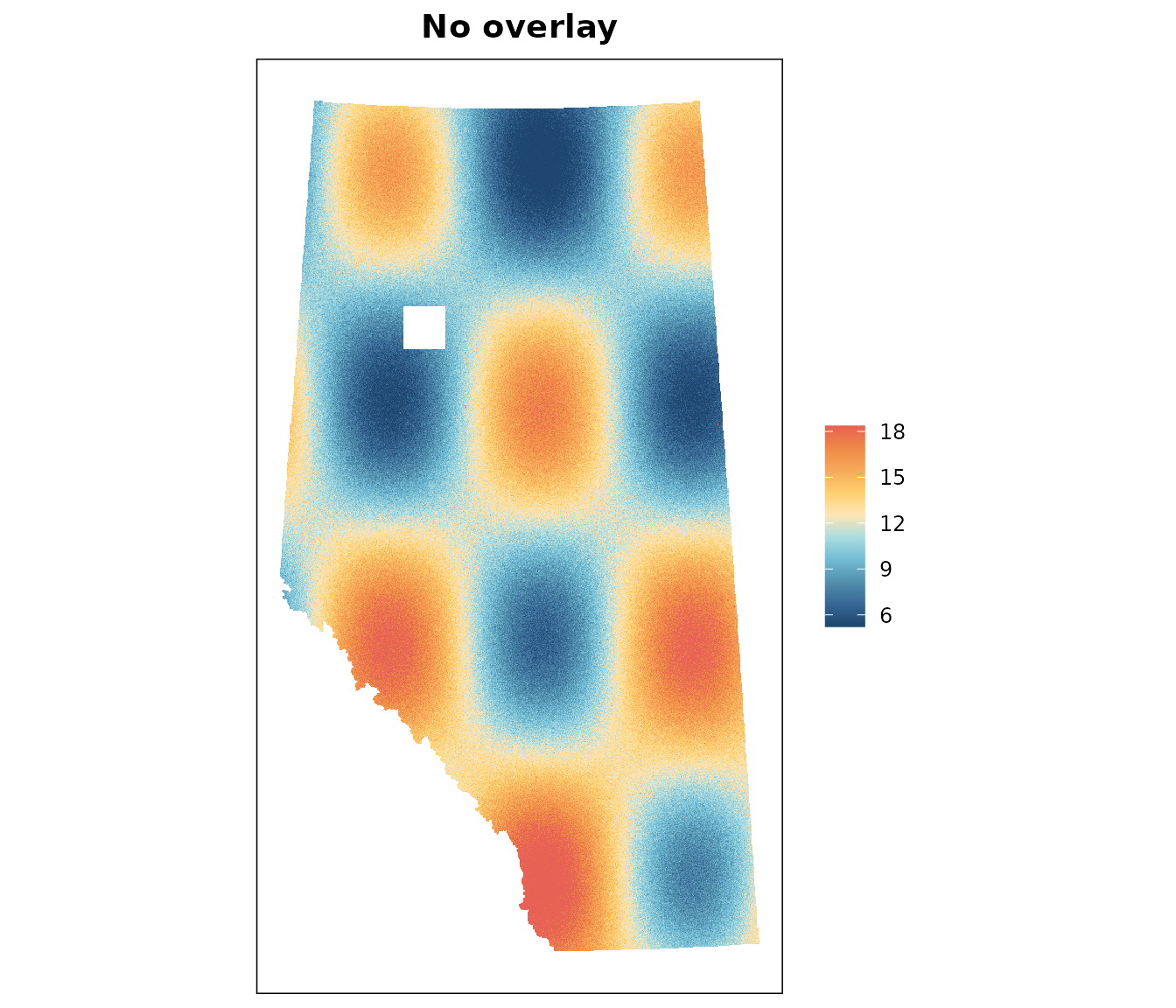
NA cells are left unpainted. Giving
them a colour turns the map into a missingness check, which is what
finds the hole:
plot_raster(chm, na_col = "firebrick2", main = "Missing cells in red")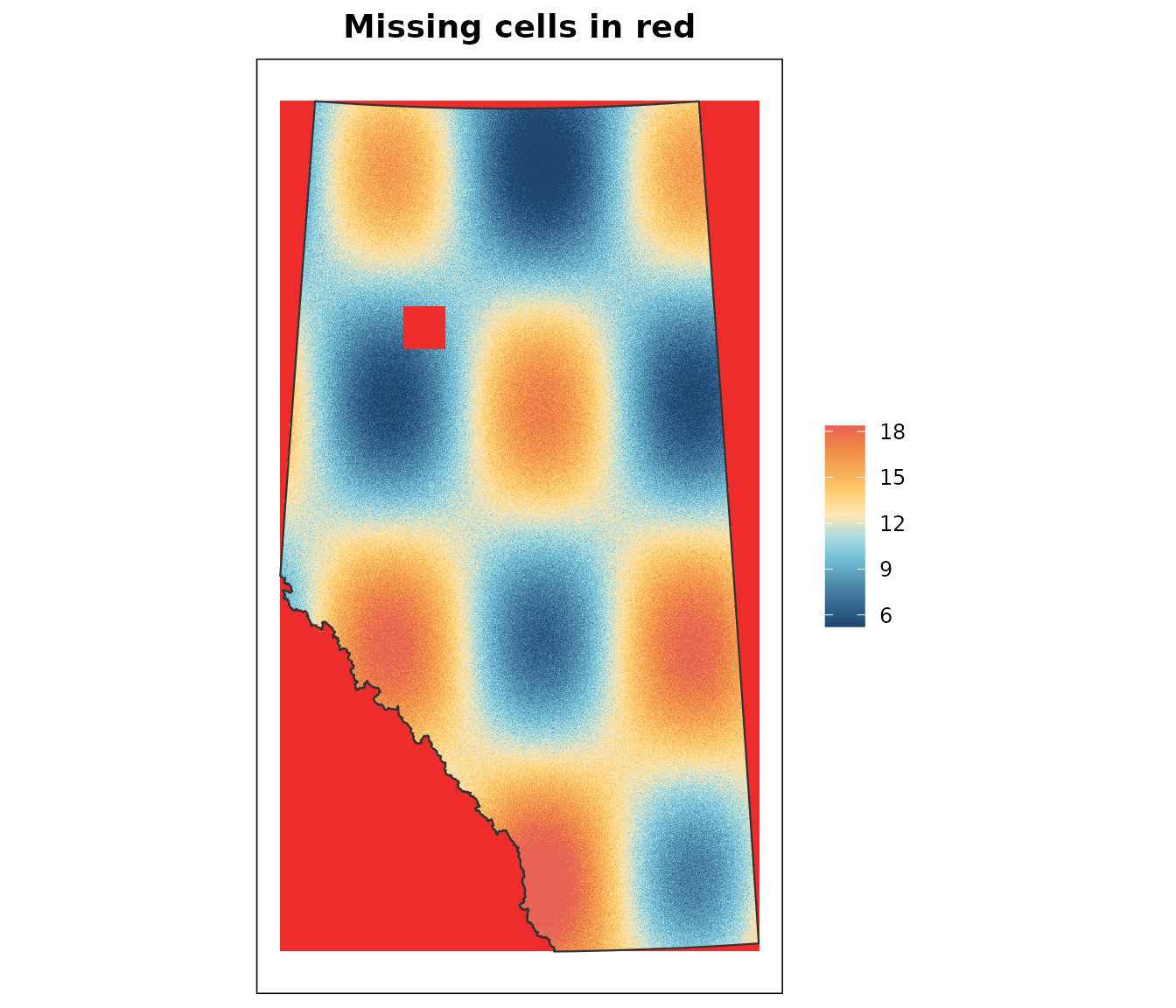
The gap is obvious, and everything outside the province is flagged too.
Multi-layer rasters
Layers are facetted, sharing one colour scale:
stack <- c(chm, chm * 1.4)
names(stack) <- c("chm_2020", "chm_2024")
plot_raster(stack, boundary = NULL)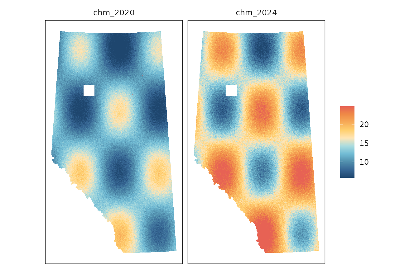
A shared scale is what makes two dates comparable, but it is wrong
for bands in different units — an elevation layer beside a slope layer
would flatten one of them. Plot those one at a time
(x[[1]]), so they each get their own stretch.
It is a ggplot
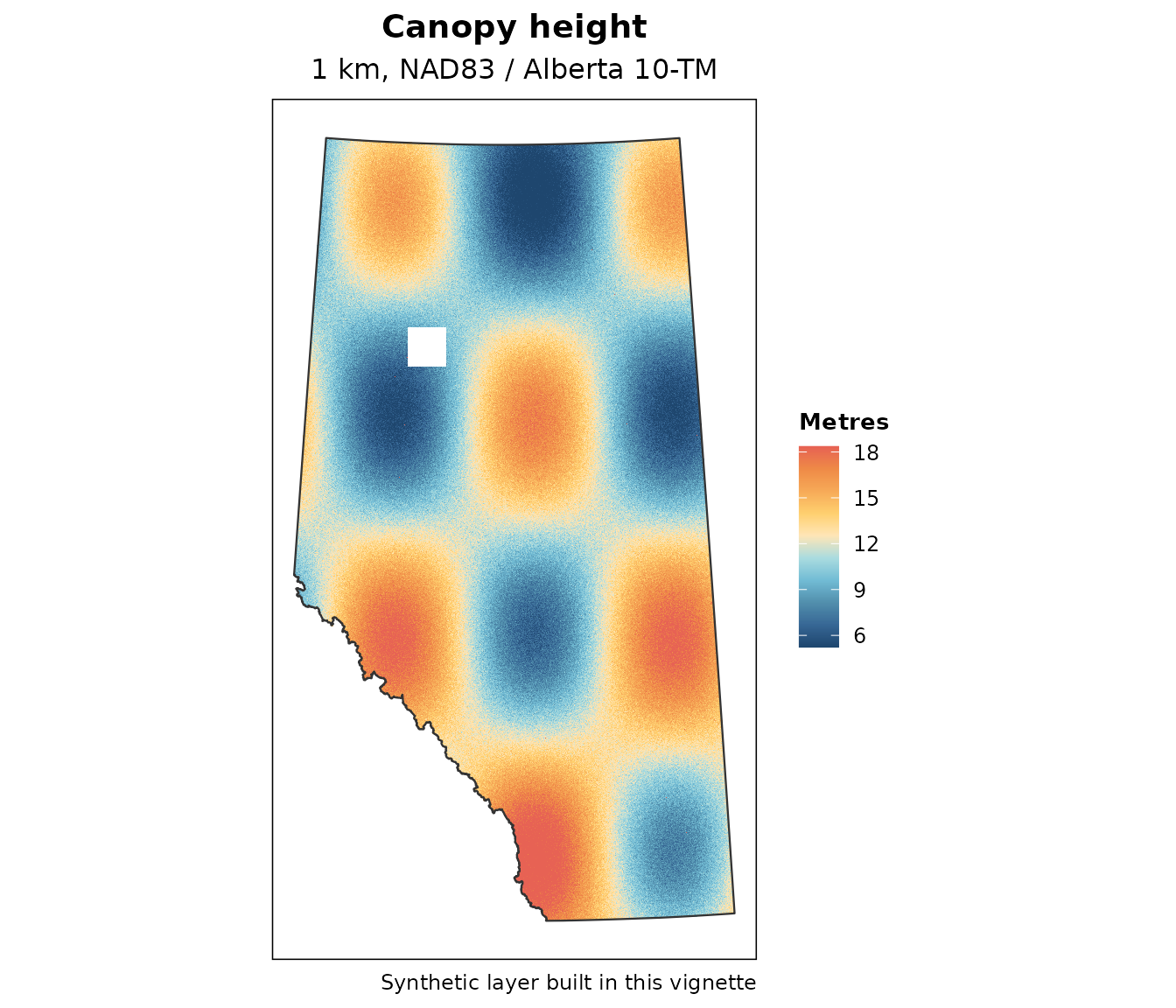
Nothing is drawn until the object is printed, so the map composes and saves like any other plot:
# Keep double quotes out of fig.alt anywhere in this package: the
# text is interpolated straight into the img tag's alt attribute,
# so a quote closes it early and the whole figure renders as
# escaped markup rather than an image.
library(ggplot2)

plot_raster(chm, legend_title = "Metres") +
  labs(
    title    = "Canopy height",
    subtitle = "1 km, NAD83 / Alberta 10-TM",
    caption  = "Synthetic layer built in this vignette"
  )
p <- plot_raster(chm)
ggsave("2_pipeline/canopy_height.png", p, width = 9, height = 6,
       dpi = 200)
Adding a scale_fill_*() or a theme replaces the defaults
in the usual way.
plot_hist()
The distribution behind the map, filled along the same ramp so the two read together:
plot_hist(chm)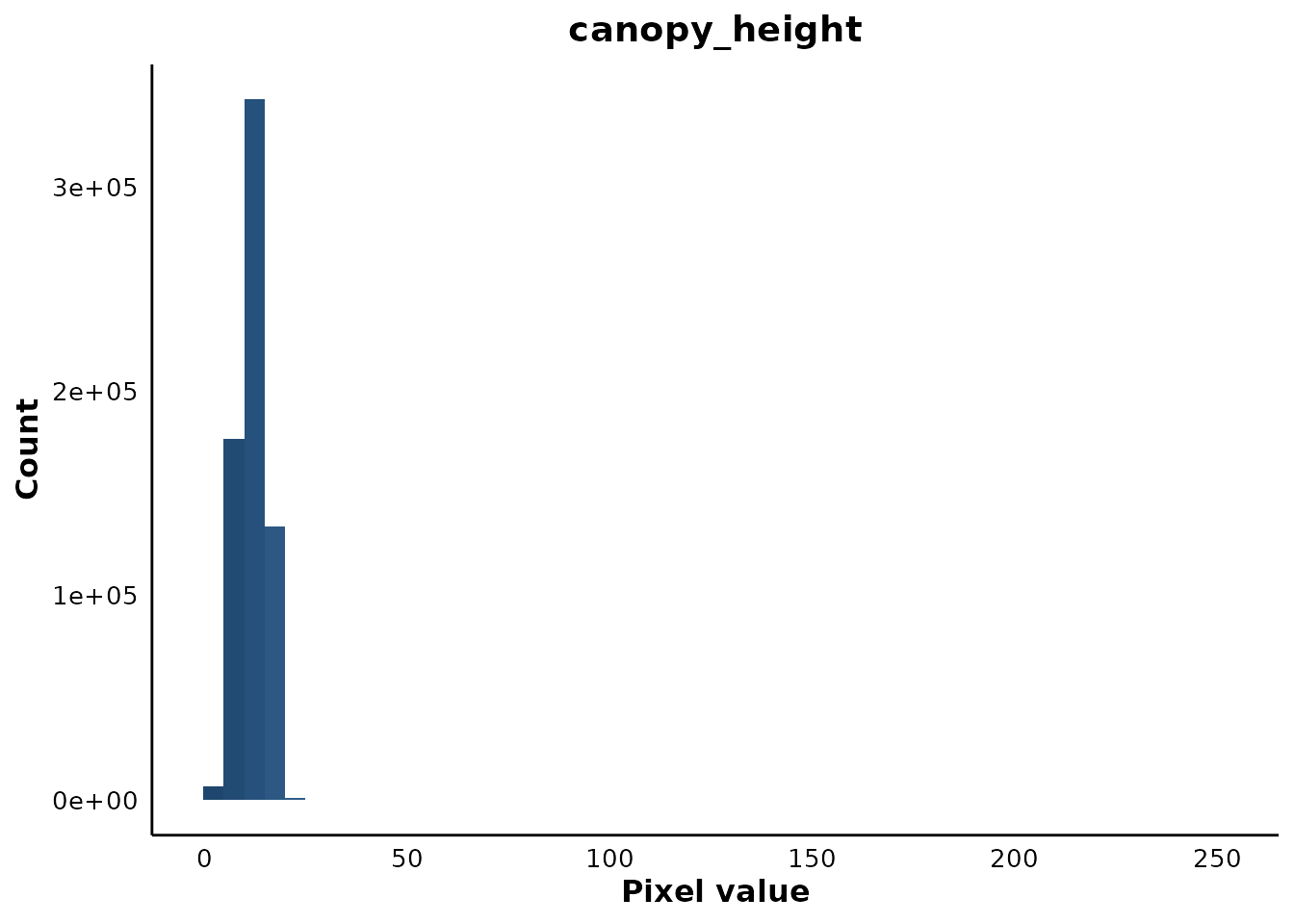
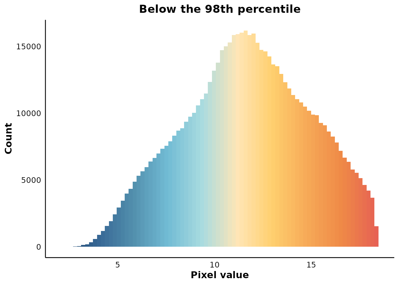
The x axis runs to 250 because the glitch cells are still in there — the histogram shows the tail the map’s stretch hides, which is the division of labour between them. Clamp them off and the shape appears:
q98 <- raster_stats(chm, quantiles = 0.98, verbose = FALSE)$q98
plot_hist(
  clamp(chm, upper = q98, values = FALSE),
  bins = 80,
  main = "Below the 98th percentile"
)
Multi-layer rasters facet here too, but with free scales, since bands rarely share a value or a count range:
plot_hist(stack)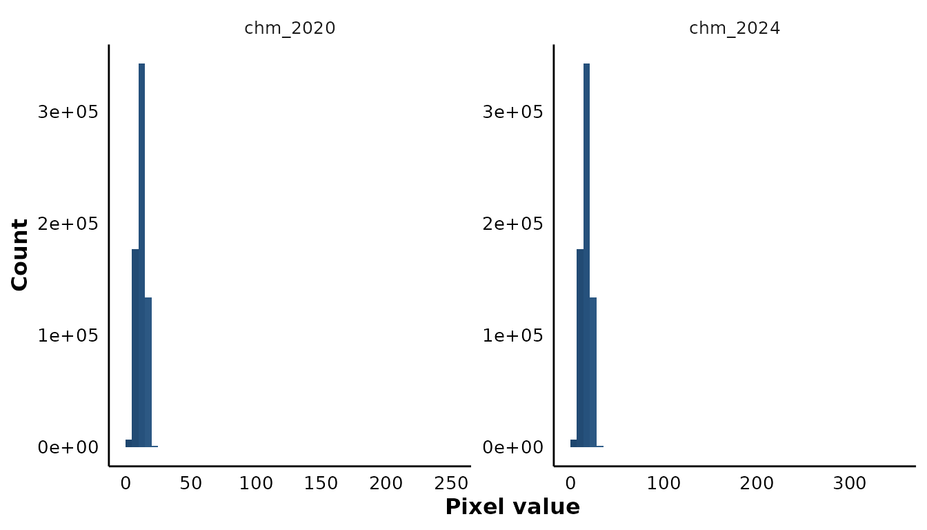
Each panel ramps through the whole palette. The fill is the bin’s position within its own layer’s range, not an absolute value.
Theme and palette
Both plots use the “Hiroshige” palette from MetBrewer, reversed
so low values are dark blue and high values red. The ten hex codes are
reproduced inside the package, so MetBrewer is not a dependency. The
theme is exported for other figures in a project
(theme_science_map()).
ggplot(stats, aes(x = layer, y = mean)) +
  geom_col(fill = "#376795", width = 0.4) +
  labs(title = "Any figure, same look", x = NULL, y = "Mean") +
  theme_science_map()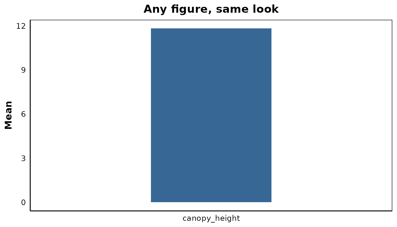
Override either by passing col or by adding your own
scale or theme to the returned plot.
Known gaps
Both plot functions downsample to maxcell (5e5) cells
before building the data frame they draw from, so a province-wide map is
a preview rather than a rendering of every cell, and
plot_hist() is a sample of a large layer rather than a
census of it. The counts in raster_stats() are exact
regardless; only its quantiles columns sample.
Facetted maps share one colour scale, which is wrong for bands in different units. There is no per-layer stretch — plot single layers for that.
Neither plot function accepts a directory the way
raster_stats() does; they take one raster at a time.